The 1969 Olivetti Valentine

Kodak Color Plus 200 with the Nikon F3

Released on Valentine’s Day in 1969, the Olivetti Valentine has since been renown as an icon of contemporary industrial design. The machine was designed in 1968 by Ettore Sottsass, an Italian designer from the Royal College of Art. Ettore did something that had never been done to a typewriter before—he pushed it past the bounds of utility and into consumerism. A worldview that now dominates today, but was relatively new in the early 1970s. The typewriter suddenly became more of a statement piece than a working professional’s machine. Art critics praised it as “the biro of typewriters,” and “the handbag machine,” highlighting its allure as a consumer item, a fashion statement, and a representation of a new era. It was so well received that the Metropolitan Museum of Art in New York requested one for permanent display. It remains the only typewriter on permanent exhibition there, as well as the only typewriter with a built in carrying handle. It’s through and through unique and iconic, marking the beginning of the modern era of consumerism in Western Culture.


I picked this machine up in very good condition for a good price. It only had three issues besides a need for a clean. It had a lose carriage, a broken bell, and poor capital alignment. The first thing I noticed was the German keyboard layout, and of course that iconic backspace.

Getting the body off the machine is decently easy. The rear plate with the handle comes off with two screws and two nuts, while the key guard is held on with only two nuts. A small diameter socket can undo these, but it is really difficult to get a tool to fit. The body itself is a mere sleeve on the machine, held in place with four screws along the bottom.
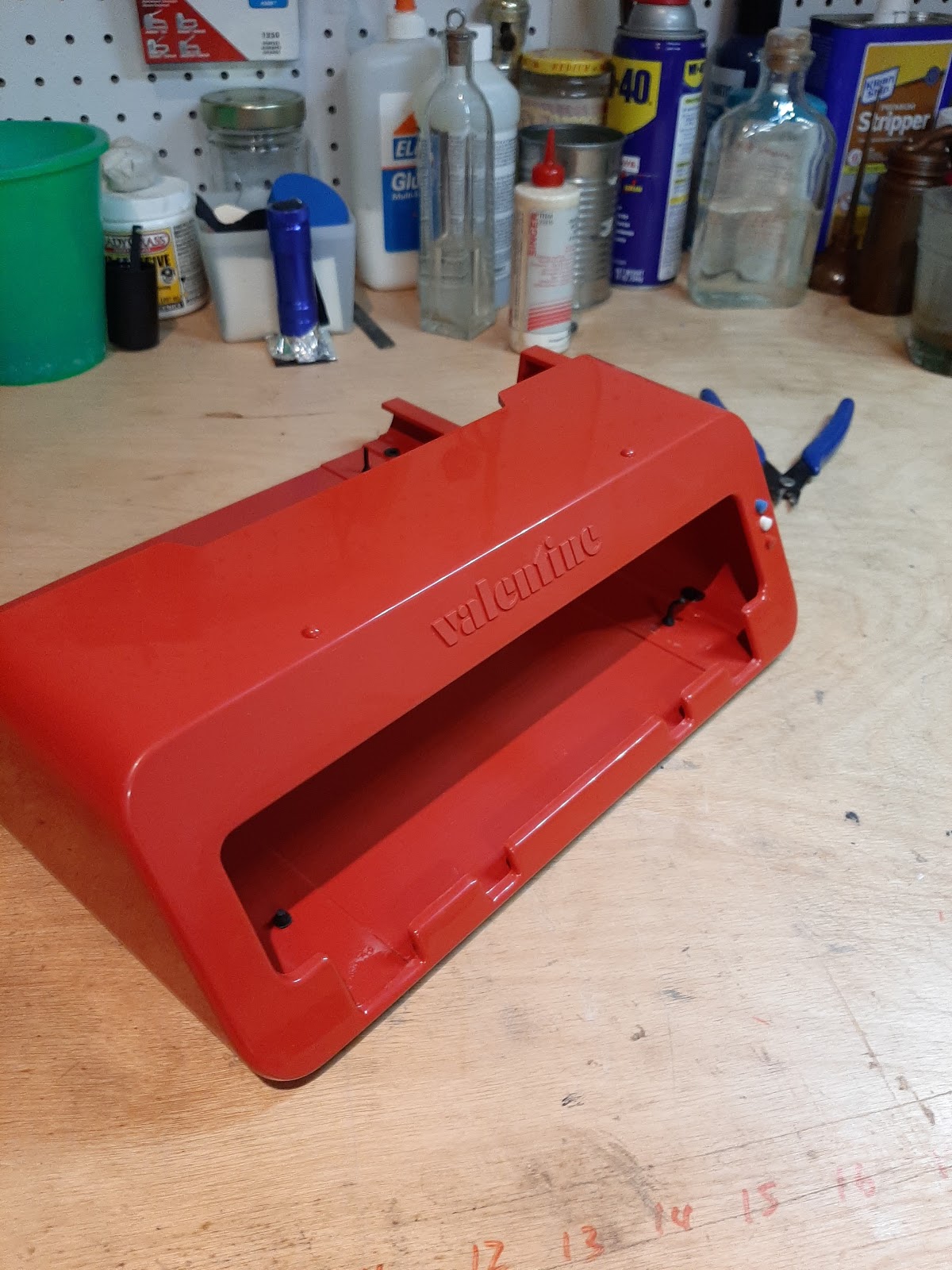


The platen comes out a little differently, the left knob is standard threaded onto the platen, but the right knob is attached with set screws. Once this comes out, the paper tray and feed system can be removed much like any other Olivetti. At this point the carriage covers can also be removed. Once that was done, I adjusted the carriage rails to tighten down a little more, and fixed the bell striker. These were the only major issues, the rest of the machine worked well, typing much like the 22, but with a lighter touch. Once this was done, I gave it a good wash down and a scrub, and adjusted the shift. These are adjusted on both sides of the type basket, with a lock nut on the bottom. For the basket to move smoothly, both sides must be adjusted the same.


When all was said and done, I polished everything and re assembled it. Note that the top row of keys, including the margin release and the color selector, get in the way of putting the shell back on. They must all be depressed, and this can be done by tying all the slugs for the top row of keys in the up position.
All in all, the machine grew on me a little bit, and I was hesitant to sell. My initial impression a few years back was distaste. I just wasn’t a fan of the design, but it is a very cool machine, and it types a fair bit better than some people would give it credit for. It’s real merits lies in its design history, more so than its utilitarian purpose. After all, it was first and foremost a machine of style and class.


Featured below is the product of a recent photoshoot I did. Used Kodak Color Plus on my Nikon F3, full story featured HERE.


Looking good! I use my Valentine once in a while; it's not bad. I agree that its main interest is as a piece of design.
ReplyDelete